Custom designed to sell confectionary products
Supermarket product point of sale display units


No agency design brief required!
How is that possible I can hear you asking?
Well Lindt has engaged Genesis Retail Displays many times to create custom made free standing display units for their range of confectionary products. Have a look at the one we made that went into Woolworths here.
The relationship between Lindt’s brand stakeholders and our point of sale display design team in Sydney makes it relatively easy to create new displays when required. With a deep understanding of their brand and how it needs to be presented our team can quickly come up with new ideas that fit into their way of operating.
When we combine our experience working with small, medium and large supermarkets in Sydney, it becomes a strong combination because we know what OH&S requirements we have to deal with, height restrictions, power sources & even simple things like aisle spacing or planogram needs.
We take all these things into consideration at our design stage. This makes it easier for product or brand managers to work with us, they don’t have to explain everything as we just ‘get it’ from the beginning.
What was the design required for the display?
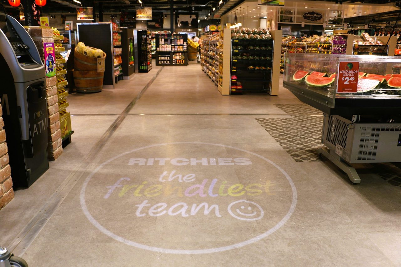
For this project Lindt needed a new floor standing display to be created. To maintain their category leadership position they had been given a large floor space area in the new Ritchies Fine Food & Wine Merchants store at Taren Point in southern Sydney. Essentially they had to create their own aisle to carry their range of confectionary products.
This custom made point of sale display was part of a $10.4 million refurbishment of the old retail store. According to Ritchies Stores CEO Fred Harrison, the new store – which is 3600sqm in size – offers world class quality and standards for all your food and liquor needs.
So showcasing global brands like Lindt makes perfect sense to attract shoppers, increase average selling prices & create brand credibility for the store. For some perspective, greeting you on entry at Ritchies Taren Point is a display of flowers, plants and giftware. Adjacent to the gifting section is a premium chocolate display, featuring treats from Lindt, Koko Black and Ministry of Chocolate.
In fact, the whole shopping experience has been completely transformed where sensible adjacencies have been created to sell ideas & concepts together. Rather than another supermarket with boring aisles loaded with products, there are areas for different food types, specialities and it is more like walking through a shoppers bizarre or farmers market.
Creating the shape and form of the display
As with all of our project briefs we absorb as much as we can from the client. So in this case Lindt provided us with some pretty clear guidelines around what they needed. Essentially it was their own aisle within the store that had to be created.
Part of the layout and design needed to include;
- Suitable shelf heights to cater for multiple rows of stock.
- Shelf edging that could hold retail store price or promotional ticketing.
- Adjustable shelving to enable different planograms to be implemented.
- Lightboxes along the top of the shelf units that could be used for branding or promotional purposes.
- End caps on either end that could hold bulk stock or be used for seasonal or catalogue promotions.
- Defined ‘bays’ that could be used to segment ranges of products.
- The ability to create brand blocks so that assortments could be showcased together.
So we created a unified design that has now become a powerful example of category leadership for Lindt within Ritchies Fine Food & Wine Merchants Tarren Point. This same type of structure and design can be applied to numerous grocery categories, hardware electrical stores or even consumer electronics. The ‘bones’ of the display are suitable for lots of retail store environments if the space is available.
So we satisfied the brief to devise, create, manufacture, deliver and install a completely bespoke category management solution for a premium international brand.
The construction materials included high-end laminates, back-lit headers and downlit shelving that is more commonly associated with the presentation of cosmetic products. Using such premium materials creates a super-classy beacon for shoppers as soon as they enter the area.
Get ideas from this point of sale display
Hopefully the photos demonstrate just how impactful this display space is. By Lindt investing in the this type of retail floor space and their own fixture that pretty much guarantee ‘ownership’ over the surrounding area and category.
It creates stopping power and because it is placed next to suitable product add-ons like flowers it makes it an easy way to increase the basket size for shoppers visiting the store without the need for retail shop assistants too.
The highlights
- Visual impact – having a completely branded, dedicated fixture in a retail store ensures you can completely own the look and feel of the display with your products.
- Lighting – While most retail locations are fairly bright, in this store it has a moody feeling, so having the lit header board areas helps the display really pop. These can be changed to suit other brands, a new product or seasonal promotions.
- Brand blocking – the simple modular layout makes it easy to brand block products in single, double or even triple bays to suit any type of planogram.
- Scaleable – with the modular design, units can be added to make this into a multi aisle display, an L shape, U shape or extend it to be longer. It means it can be scaled up or down to suit different retail floor plans.
- Durable – The high quality materials used in production together with the metal framework means they will be durable enough to handle thousands of shoppers & store staff using the display to buy or restock it.
- Great for promotional uses – now the brand ‘owns’ their own space it makes it easier to run exclusive promotions for the store, launch new products or feature particular items when needed to suit launches, seasonal or catalogue periods.
- End caps for promos – the end caps can quickly be turned into promo ends that can be used for weekend sampling, giveaways, demonstrations or other promotional uses.
- Australian made – Production was carried out in Australia in our factory. So our team manages every aspect from end to end from design to installation to make sure quality standards are high.
So when you get a quote for point of sale for free standing display units, there might be more than meets the eye. Cheapest isn’t always the best & here you can see how a completely custom designed unit has been deployed for confectionary products in a way that can deliver a wide range of benefits.
If you look beyond the initial cost & consider your brand share of shelf, sales targetting opportunities or even brand exposure, the investment is well worth it.

